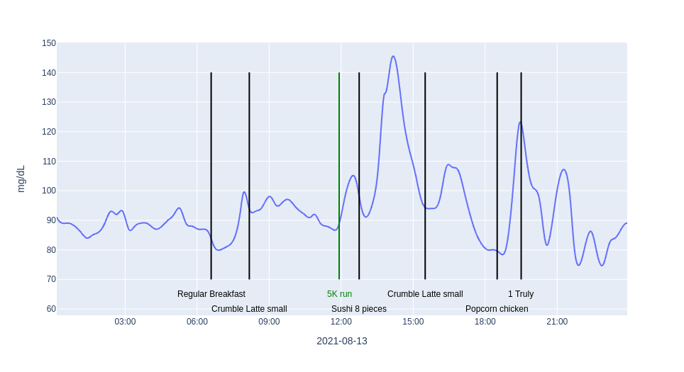
Let's Put It All Together and Chart Everything for One Day

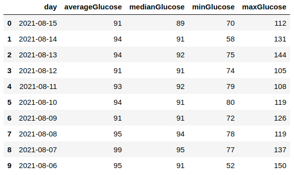
After exploring in previous notebooks how to make a nice chart , how to add meals and exercise to the chart and finally how to calculate basic metrics , lets put it all together and make a nice overview chart for one day. The chart below shows glucose data for one day and simple glucose metrics in a small text box in …

Calculating Basic Metrics

In addition to making charts, it is also possible to calculate metrics using the same Pandas dataframes that I used before. This notebook calculates the average and median glucose value for every day in the exported data. It does also calculates the minimum and maximum glucose value. The two images below show sample …

Adding Meal and Exercise Events to the Chart

One nice feature of the chart on the NutriSense Dashboard - Activity page is that events like meals and exercise are shown right in the chart. This presents the glucose data in relation to events that will likely influence glucose levels. As I had mentioned in a previous post , the NutriSense data export contains all …

The Second Chart - Making It Look Nicer

Building on the first chart , let’s add a few things to the chart that everyone expects to see in a chart like this, like the unit for the y-axis and a proper x-axis title. Because the sensor only provides data every 15 minutes the first chart looks a bit rough. The NutriSense app on the phone makes the chart …

The First Chart - Glucose Measurements Over Time

The first thing that I want to do when I explore a new dataset is chart it. Because I am familiar with Jupyter Notebooks , Pandas and Plotly , that is the technology that I picked to make the first chart. In order to execute the notebook that I am sharing below, you only need to be familiar with Jupyter Notebooks and …