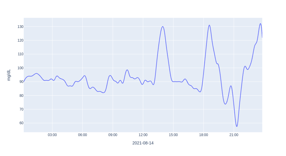
The Second Chart - Making It Look Nicer

Building on the first chart , let’s add a few things to the chart that everyone expects to see in a chart like this, like the unit for the y-axis and a proper x-axis title. 
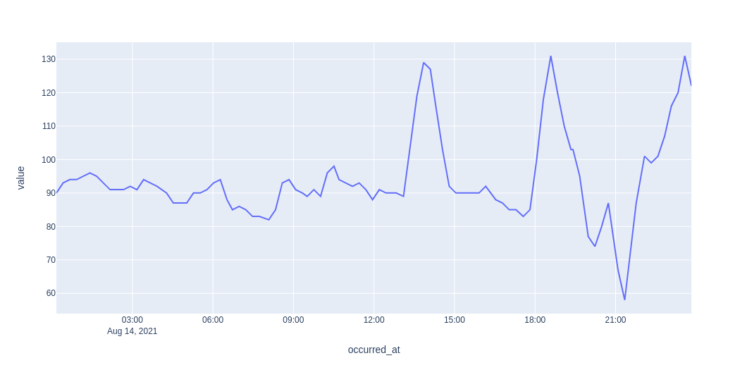
Because the sensor only provides data every 15 minutes the first chart looks a bit rough. The NutriSense app on the phone makes the chart …

The First Chart - Glucose Measurements Over Time

The first thing that I want to do when I explore a new dataset is chart it. Because I am familiar with Jupyter Notebooks , Pandas and Plotly , that is the technology that I picked to make the first chart. In order to execute the notebook that I am sharing below, you only need to be familiar with Jupyter Notebooks and …

Exporting NutriSense Data

Before even signing up for NutriSense, I verified that the glucose measurement data could be exported. I was pleased to find that in the release notes for the app update of October 2019 NutriSense described new functionality that made it possible to export all data. The document states that the data will be provided in …

Why This Website

After receiving lab results in August of 2021 and noticing that my HbA1c had jumped to 5.7, I was a bit concerned with my glucose levels. I had looked into continuous glucose monitors (CGM) in the past and had even used a Dexcom G6 a few years ago. After doing a bit of reading online I came across NutriSense and …